All you need to know about handling typography on the web
Text is an essential component of design. It provides clarity, precision and depth that other forms of communication struggle to achieve. At Origin Blank, we design content and brand style guides to properly inform how your copy (and other elements) look and feel for your people.
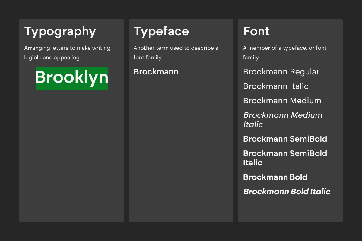
Typography vs typeface vs font
Understanding the difference between each term is more important when collaborating with designers to create web interfaces, as there are different terms used to define the same concept in design and development for whatever reason.
Typography
Typography is the art of arranging letters that makes writing visually legible and appealing to the reader.
Typeface
A typeface is another term for a font family of different weights.
Font
A font is a member of a typeface, or font family.
Creating visual hierarchy
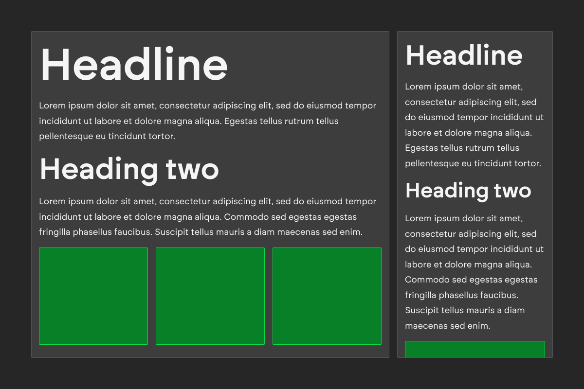
Visual hierarchy establishes levels of importance in your web interface achieved through a typographic hierarchy. Without this hierarchy, a person struggles to differentiate blocks within an interface. So naturally, the question is asked: how do we create a typographic hierarchy?
Type scales
When designing an interface, designers opt for type scales, which dictate related type levels, since they grow by the same ratio to create a balanced and friendly interface.
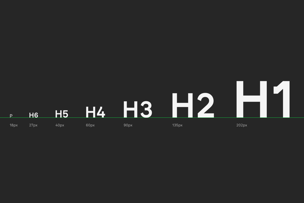
There are different blueprints of type scale ratios to choose from, and they often depend on the specific needs and purpose of the interface. For example, lower contrast ratios are for long-form copy (such as a blog post or wiki), and higher contrast ratios are for posters and advertisement pieces.
Here is a list of the type ratio blueprints used on web interfaces.
Low contrast ratios
These ratios are suitable for product sites.
- 1.067 (Minor Second)
- 1.125 (Major Second)
- 1.2 (Minor Third)
Medium contrast ratios
These ratios are suitable for blog and info sites.
- 1.25 (Major Third)
- 1.333 (Perfect Fourth)
- 1.414 (Augmented Fourth)
High contrast ratios
These ratios are suitable for marketing sites.
- 1.5 (Perfect Fifth)
- 1.618 (Golden Ratio)
Here is an extended cut of ratios used in graphic design.
- 1.777 (Major Sixth)
- 2 (Octave)
However, while there are tried-and-tested blueprints of type scales when creating web interfaces, we must create responsive layouts as well, and the type ratios used on larger-width screens might not work particularly well on smaller-width screens, and vice versa, bringing us to the following section.
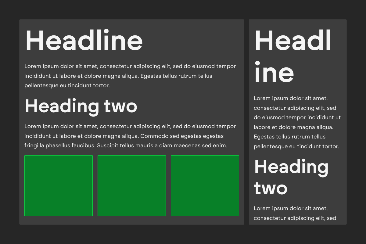
Responsive typography
When designing interfaces, consider the environment in which they're being served.
For web interfaces, these include mobile, tablet, laptop and desktop. When defining the layout of an interface, layout variations should exist depending on the device it is served on.
The optimal way to create a responsive type scale for an interface is by choosing a second type ratio which suitably fits smaller or larger screen widths.
The optimal way to create a responsive type scale for an interface is by choosing a second type ratio which suitably fits smaller or larger screen widths.
Implementing accessibility
Headings
Heading copy must have sufficient visual contrast to other copy on your page by bolding and increasing the size of headings compared to body text. However, headings should still be displayed using their respective heading elements.
Selectable text
Document text should have the ability to be selected, copied and pasted onto another location.
Descriptive links
Link copy should describe the destination, and needs to make sense when read out of context. Similar to headings, links must also have sufficient visual contrast to other text on your page.
Structure
Text on a document must follow a logical hierarchy by ordering heading levels consecutively, forming a list from related items, and ensuring that the reading flow follows a top-to-bottom and left-to-right order. Any emphasis in your copy must be italicised using <em>, and importance should be bolded using <strong>.
Summary
Origin Blank specialises in all things branding and web. Need help with your project? Say hello, and let's fill the blank with something wonderful.